
The Best Chart Types for Visualizing Two Categorical Variables
You know that feeling when you're staring at a spreadsheet, and you have two columns full of labels—like 'Product Category' and 'Region'—and you just know there's a story hiding in there? I've been there more times than I can count. Seriously, I've built dashboards for clients who handed me messy survey data and said, "Make this make sense." The problem isn't the data itself; it's picking the best chart types for visualizing two categorical variables that actually does the job without making your audience squint.
Look—I've seen people try to cram two categorical variables into a standard bar chart and end up with a monstrosity. It's painful. But it's also completely fixable. Over the last decade, I've tested dozens of chart types, and I'm going to walk you through the ones that work, the ones that don't, and the subtle tricks that separate a good visualization from a great one.
Honestly? If you're working with two categorical variables, you've already got a harder job than someone with numeric data. Categories don't have a natural order (or they might, but it's tricky), and your job is to show relationships without lying with the scale. Let's dive into the tools that actually help.
The Stacked Bar Chart: A Classic with a Catch
If you've ever asked a colleague how to show two categorical variables, chances are someone pointed you toward a stacked bar chart. It's the default, and for good reason. It's simple to read, easy to build, and it fits neatly into a report. But here's the thing—it's also the most abused visualization in this category. I've lost count of how many times I've seen a stacked bar that actually obscures the very pattern it's supposed to reveal.
When Stacked Bars Work (and When They Don't)
Let me be clear: a stacked bar chart works beautifully when you want to show the composition of each category across a second variable. Imagine you have survey responses by region (East, West, North) and you want to see the breakdown of satisfaction scores (High, Medium, Low). That's a perfect use case. The total bar height gives you the count per region, and the colored segments show proportions within each region.
But here's the catch—stacked bars fall apart when you need to compare individual segments across categories. Can you easily tell if the 'Medium' satisfaction score is higher in the East than in the North? Probably not. Your eyes are terrible at comparing the same color across different total bar heights. It's a cognitive trap.
So what do you do? Don't throw out the stacked bar entirely. Use it when the categorical variables have a natural hierarchy and you care more about total counts and approximate proportions than precise segment comparisons. And please, for the love of good design, avoid stacking more than four or five segments. It becomes noise.
The 100% Stacked Bar Alternative
This is my secret weapon when proportions matter more than raw counts. A 100% stacked bar chart normalizes each bar to the same height, so you're only comparing percentages. It's a lifesaver when your categories have wildly different total counts. For example, if Region A has 1,000 responses and Region B has only 50, a standard stacked bar makes Region B look tiny. The 100% version levels the playing field.
I use this all the time for survey data. It tells you, "Regardless of how many people we surveyed, here's the distribution." It's honest. It's clear. And honestly? It's one of the best chart types for visualizing two categorical variables when your primary question is about ratios, not totals. Just remember to add a note about the actual sample sizes—otherwise, your audience might think the smaller group has equal weight.
The Grouped Bar Chart: For Precise Comparisons
Now we're talking. If your goal is to compare the exact counts or proportions of one categorical variable across the levels of another, a grouped bar chart is your best friend. I call it the 'side-by-side' chart because that's exactly what it does—it puts bars for each subcategory right next to each other, grouped by the main category.
Side-by-Side Clarity
The magic here is that your eyes can easily judge the height of bars that share the same baseline. If you want to know whether more men or women prefer Product A in each region, a grouped bar chart gives you that answer instantly. No mental math required. No squinting at mismatched baselines.
I've built grouped bar charts for marketing teams that needed to compare customer preferences across age groups and purchase channels. It saved us hours of debate. The key is to use contrasting but not jarring colors for the subcategories, and always, always label the axes clearly.
But there's a limit. If you have more than, say, four subcategories per group, the chart gets cluttered fast. Bars become thin, labels overlap, and your audience starts to feel overwhelmed. When that happens, it's time to consider a different approach.
The Overcrowding Problem
Here's a real-world example from my consultancy days. A client had 12 product categories and 10 regions. They wanted a grouped bar chart. I told them it would look like a porcupine. They insisted. The result was a chart with 120 skinny bars, almost none of which were legible. It was a disaster.
So here's my rule of thumb: if the total number of bars (categories times subcategories) exceeds about 30, you need a different chart. You could try a heatmap or a faceted approach (small multiple charts). The grouped bar is powerful, but it's not a universal tool. Use it when precision matters and your data is manageable.
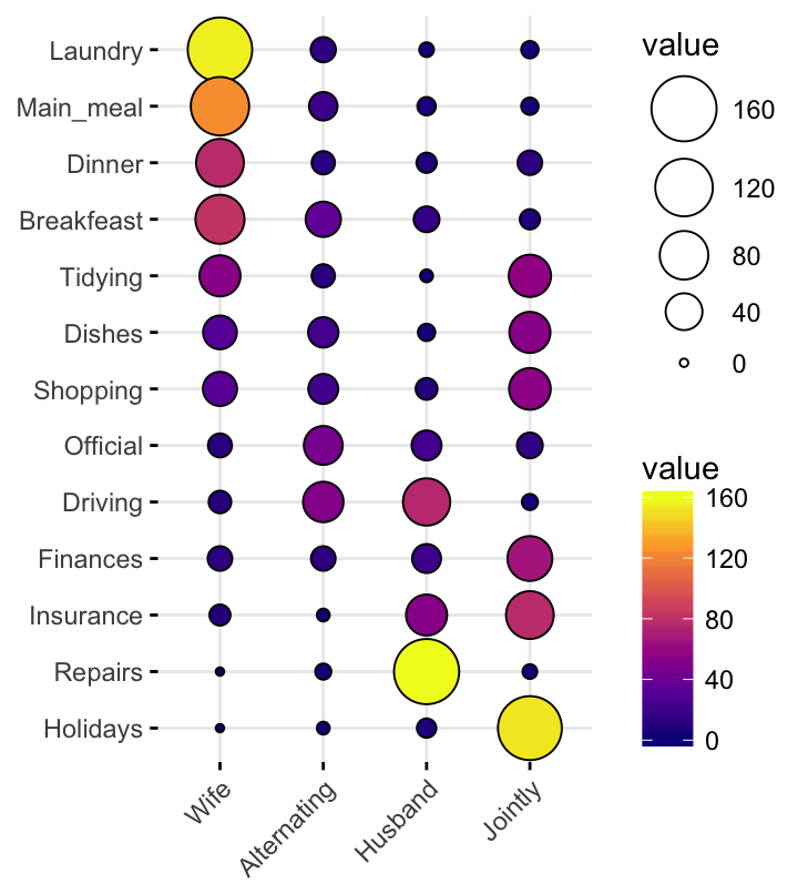
The Heatmap: Density and Pattern Recognition
When your two categorical variables have many levels each, a heatmap is often the unsung hero. I love heatmaps because they let you see patterns across the entire grid at a glance. Your brain processes color gradients faster than it processes individual bars. It's evolutionary, I guess.
Color as a Third Dimension
The heatmap uses color intensity to represent the count or proportion for each combination of categories. Think of it as a spreadsheet where every cell is colored. Darker means more, lighter means less. It's incredibly efficient.
I used a heatmap once to show a pharmaceutical company the side effect profiles of different drugs across patient demographics. We had 15 drugs and 8 age groups. A bar chart would have been a nightmare. The heatmap revealed a clear cluster of side effects in younger patients for one specific drug in under three seconds. That's the power of pattern recognition.
When building a heatmap, pay attention to your color palette. Don't use a rainbow. Stick to a sequential gradient (light to dark) for counts. If you need to show divergence (e.g., above or below average), use a diverging palette. And always include a legend. Always.
The Missing Count Problem
Here's where heatmaps can trip people up. What happens when a combination of categories has zero observations? In a bar chart, that's just a missing bar. In a heatmap, it's an empty or white cell. That's fine, but you need to decide whether a zero means "no data" or "zero occurrences." Those are very different things.
I've seen analysts accidentally interpret empty cells as "no problem" when they actually meant "no data collected." That's a dangerous mistake. If you're using a heatmap for visualizing two categorical variables, make sure your data is complete, or clearly mark missing combinations. A good practice is to use a neutral color (like light gray) for missing data and a distinct color for true zeros.
The Mosaic Plot (Marimekko Chart): Proportional Relationships
All right, let's get a bit geeky. The mosaic plot (also called a Marimekko chart) is one of the best chart types for visualizing two categorical variables when you want to show both the proportions of the main categories and the proportions within each subcategory. It's like a heatmap and a 100% stacked bar had a baby.
Seeing the Whole Picture
Here's how it works: the width of each rectangle represents the proportion of the main category (e.g., Region A has 30% of total customers). The height of each rectangle represents the proportion of the subcategory within that main category (e.g., within Region A, 60% are satisfied, 30% neutral, 10% dissatisfied). You end up with a grid of rectangles whose areas encode the total count for each combination.
It's elegant, but it's also demanding on your audience. Not everyone can read a mosaic plot intuitively. I've used them with data-savvy stakeholders (think actuaries and data scientists) and they loved them. With marketing managers? Less so.
The Complexity Trade-Off
Mosaic plots are fantastic for exploratory analysis. When I'm digging into survey data and trying to understand how two categorical variables interact, I often start with a mosaic plot. It reveals patterns—like one region being disproportionately low in a key category—that might hide in a stacked bar.
But for a presentation to a general audience? I usually build a simpler chart alongside it. You can't assume your viewers have the same visual literacy as you. If you're going to use a mosaic plot, take the time to explain how the area encodes the data. Walk them through it. Don't just slap it on a slide and hope for the best.
The Sankey Diagram: Flow Between Categories
If your categorical variables represent two different points in time or two stages in a process, a Sankey diagram is your best bet. It shows the flow of observations from one set of categories to another. It's the chart type for understanding movement and transitions.
Tracing Movement and Change
I used a Sankey diagram for a client who wanted to track customer retention across subscription tiers. We had 'Initial Plan' (Basic, Premium, Enterprise) and 'Plan After 12 Months' (same three categories plus Churned). The Sankey showed exactly how many customers moved from Basic to Premium versus how many downgraded. The visual was stunning and immediately actionable.
The key to a good Sankey is keeping the number of categories low. More than five or six categories per variable, and the diagram becomes a tangled mess of ribbons. I'd also avoid using it for purely static comparisons. Sankey is about flow, not about static proportions.
When Not to Use It
Please, don't use a Sankey diagram just because it looks fancy. I've seen people try to use it for unrelated categorical variables (e.g., favorite color and education level). That's not a flow; that's a cross-tabulation. A Sankey implies movement or change. If your categories are independent, stick with a grouped bar, heatmap, or mosaic plot.
Also, avoid Sankey diagrams with too many small flows. If you have dozens of thin ribbons, the visual becomes noise. Sometimes, aggregating smaller categories into an 'Other' group is the smarter move. Your audience will thank you.
Common Questions About The Best Chart Types for Visualizing Two Categorical Variables
What is the best chart type for two categorical variables with counts?
It depends on your goal. For comparing exact counts across combinations, use a grouped bar chart. For showing proportions within categories, use a 100% stacked bar or a mosaic plot. For detecting patterns across many categories, use a heatmap. There's no single "best" chart—it's about matching the chart to the question.
Can I use a pie chart for two categorical variables?
Technically, you can, but I strongly advise against it. A pie chart works for one categorical variable showing parts of a whole. For two categorical variables, you'd need nested pie charts or pie-of-pie charts, which are notoriously hard to read and compare. Honestly? I've never seen a good use case for pie charts with two categories. Stick with bar charts or heatmaps.
How do I handle three categorical variables?
That's a whole other challenge. For three categorical variables, consider a faceted plot (grid of small multiples) or a 3D heatmap (though 3D visualizations can distort perception). You might also use a grouped bar chart with an additional color encoding or size encoding. But honestly, three categorical variables often require a dashboard or interactive element to avoid visual clutter.
What tool is best for creating these charts?
I've used everything from Excel to R to Tableau. For quick, straightforward charts, Excel or Google Sheets can handle grouped and stacked bars. For heatmaps and mosaic plots, I prefer R's ggplot2 or Python's Seaborn. For Sankey diagrams, specialized tools like SankeyMATIC or Tableau's built-in Sankey extensions work well. The best tool is the one you're comfortable with, but always check the default settings—they often break the rules I've outlined.
Picking the best chart types for visualizing two categorical variables isn't about following a rigid formula. It's about asking, "What question am I really trying to answer?" and then choosing the chart that answers it honestly. Stacked bars for composition. Grouped bars for comparison. Heatmaps for patterns. Mosaic plots for proportions. Sankey diagrams for flows. Master these, and you'll never stare at a messy spreadsheet without a plan again.