
Comparison of Hierarchy Charts vs Radial Tree Diagrams
Ever been in a meeting where someone pulls up a standard org chart, and you feel your eyes glaze over after the second level of boxes? I have. For a decade, I’ve been elbow-deep in data visualization, and I can tell you one thing for sure: picking between a hierarchy chart and a radial tree diagram isn’t just a design choice. It’s a strategy decision that can make or break how your audience digests the information. Seriously, I’ve seen projects grind to a halt because someone forced a 200-person org into a top-down structure that looked more like a tangled phone cord than a clear map.
So, which one do you use? It depends on the story you’re telling and the brain you’re trying to reach. Let’s break down the comparison of hierarchy charts vs radial tree diagrams from a practical, hands-on perspective. No fluff, just the stuff that actually works in the wild.
The Core Difference: Where Things Sit
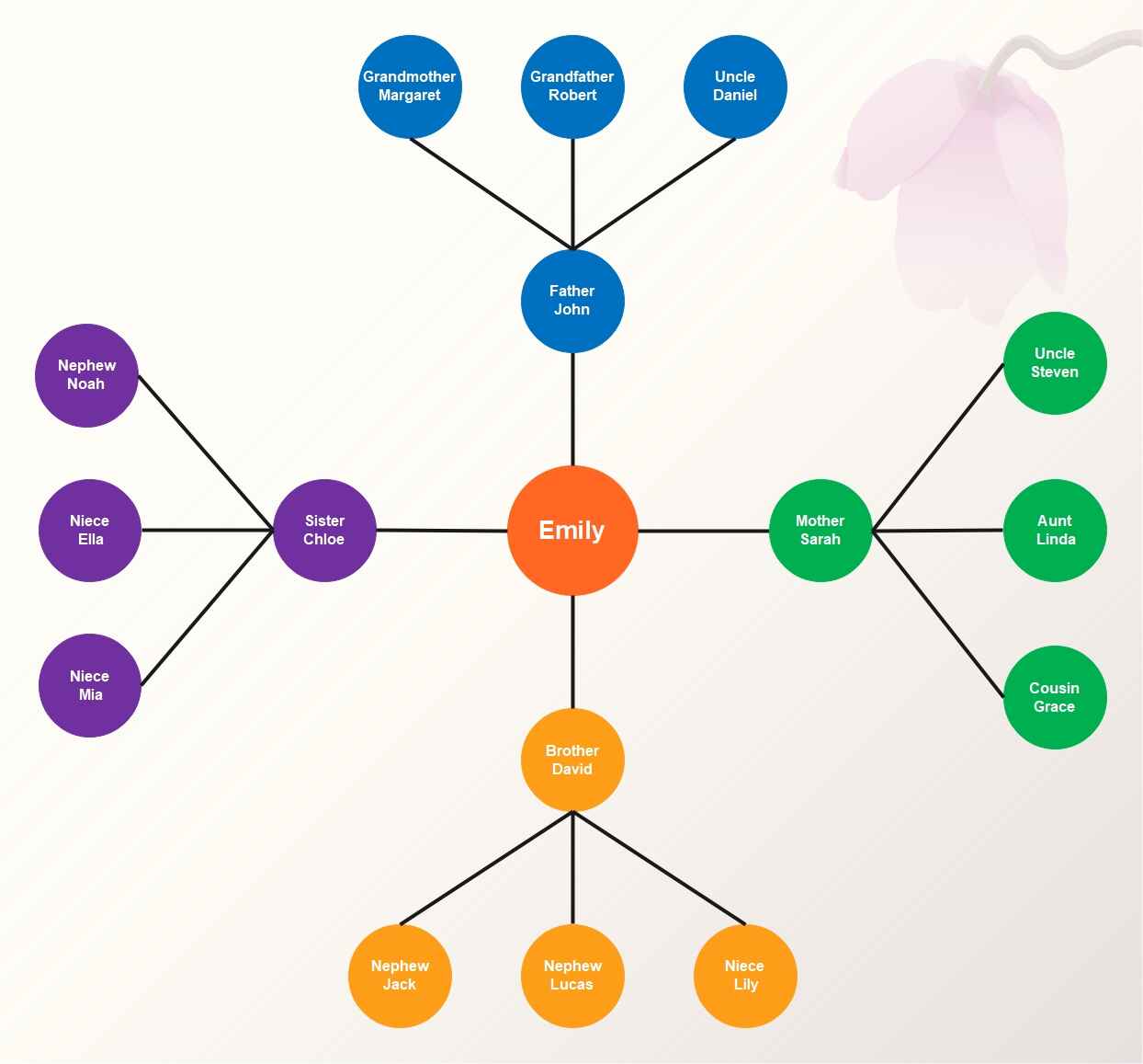
At its heart, a hierarchy chart (often called a tree diagram or org chart) is a top-down, left-to-right, or bottom-up structure. Think of a family tree on its side. You have one root, and everything branches out in a strictly linear, ranked fashion. It screams “order” and “chain of command.” It’s the default for most corporate environments, and honestly? It’s boring. But boring works when you need clarity.
A radial tree diagram flips the script. The root sits in the center, and all branches radiate outward like spokes on a wheel or a sunburst. This isn’t just a cosmetic twist. It changes how the eye travels across the data. Instead of scanning left to right or top to bottom, your eye has to pivot around a central point. It’s more dynamic, but it can also be more disorienting if you’re not careful.
Reading Direction and Cognitive Load
Look—our brains are wired for certain patterns. Reading left-to-right feels natural for most Western audiences. A standard hierarchy chart exploits this. You start at the top CEO, move down to VPs, then directors, and so on. It’s a predictable flow. The cognitive load is low because the path is obvious. You don’t think; you just follow the lines down.
With a radial tree diagram, the reading path is circular. Your brain has to stop, orient itself to the center, and then decide which spoke to follow. This takes a few milliseconds longer. For a small dataset (under 20 nodes), this isn’t a big deal. But for a complex structure like a company with 100 departments? Your audience will get lost. I’ve watched users physically rotate their screens trying to follow a radial tree. It’s both funny and a little sad.
Space Utilization and Scalability
Here’s where the comparison of hierarchy charts vs radial tree diagrams gets really interesting. A traditional hierarchy chart is a space hog. It grows vertically (or horizontally) in a very greedy way. A deep organization with eight levels will require a massive poster or a scrollable digital canvas. You end up with tiny text or a lot of whitespace that doesn’t help.
Radial trees are space-efficient geniuses. By radiating out from a center, they use the two-dimensional space much more effectively. The outer rings can hold hundreds of nodes without running out of room. It’s the best choice when you have a wide, shallow structure—like a website sitemap or a product taxonomy with many subcategories at the same level. For deep structures with many levels, however, the nodes at the outer edge become tiny, and labels start overlapping. It’s a trade-off, plain and simple.
When Hierarchy Charts Are the Only Answer
I have a rule of thumb: if you need to answer the question “Who reports to whom?” in under three seconds, use a hierarchy chart. It’s the gold standard for chain-of-command visualizations. Nothing else comes close. Corporate org charts, military command structures, and file system directories all thrive in this format. The linearity is a feature, not a bug.
But here’s the kicker: hierarchy charts fail spectacularly when you need to show relationships across branches. Got a marketing manager who works closely with the product team? A traditional tree structure can’t show that cross-connection without drawing messy dotted lines that look like a spiderweb. It becomes a nightmare to read.
Best Use Cases for Tree Structures
Let’s get specific. You should reach for a hierarchy chart when:
- You are mapping a strict reporting structure (CEO to intern).
- The data has a clear, single root and only descends one way.
- You need to emphasize levels of authority or seniority.
- The document will be printed on standard paper (radial trees need more screen real estate to breathe).
- Your audience is non-technical and expects the “standard” org chart look.
I once built a hierarchy chart for a 500-person law firm. Every partner, associate, and paralegal needed to be in a single view. A radial tree would have been a nightmare. The partners were at the top, associates in the middle, and staff at the bottom. It was boring, but every lawyer found their name in four seconds flat. That’s the win.
The Pain Points Nobody Talks About
Don’t let anyone tell you hierarchy charts are perfect. They have a dark side. When you have more than five or six levels, the chart becomes a scroll-fest. Mobile users will hate you. Also, they are terrible at showing lateral relationships. If your organization has a matrix structure (people reporting to multiple managers), a traditional hierarchy chart will lie to your audience. It simplifies reality to the point of being misleading.
Why Radial Tree Diagrams Steal the Show
Now let’s talk about the underdog. The radial tree diagram is the visual equivalent of a cool uncle. It’s unexpected, engaging, and makes people stop and look. It forces the viewer to interact with the data in a non-linear way. For presentations, it’s a killer tool to grab attention. But don’t use it just for the “wow” factor. Use it because it genuinely reveals patterns that a flat list or a standard tree cannot.
The radial layout excels at showing hierarchy without emphasizing top-down power. The center can be a concept, a person, or a project. Everything else orbits around it. This is perfect for brainstorming maps, classification systems, or any structure where the root isn’t necessarily the “boss” but the “core idea.”
When to Go Radial (and Why It Works)
You should seriously consider a radial tree diagram when:
- You have a single root with many branches at the same level. Think of a biological classification: Kingdom, Phylum, Class. The center is “Life” and everything radiates out.
- You want to show depth without taking up a huge amount of horizontal space. A radial tree can pack six levels into a small square area that a hierarchy chart would need a billboard for.
- Your audience is data-savvy and can handle a slightly higher cognitive load. Don’t show this to the board of directors who still use printed spreadsheets. They will get lost.
- You need to highlight peripheral nodes or outliers. In a radial tree, the outer rings are naturally emphasized because they are furthest from the center. This can be useful for showing “endpoints” like final decisions or leaf nodes in a decision tree.
I used a radial tree diagram for a tech company’s product roadmap. The center was the “User Journey,” and each spoke was a feature category (Payment, Support, Navigation). It worked because none of the categories were “above” the others. They all emanated from the same core experience. A traditional hierarchy chart would have implied that “Payment” was less important than “Navigation,” which wasn’t true.
The Hidden Cost of Beautiful Charts
Here’s the honest truth about radial tree diagrams: they are a pain to label. Text in the center is fine, but text on the outer rings often has to be rotated or abbreviated. If you have long names, you’ll spend hours tweaking font sizes and angles. Also, compare a hierarchy chart and a radial tree for the same dataset side-by-side—the radial version often takes longer to understand for the first time. It’s a different mental map.
Making the Final Call: A Practical Framework
After years of building both, I’ve developed a simple mental shortcut. Ask yourself two questions. First: Does the audience need to find someone specific quickly? If yes, hierarchy chart. Second: Does the structure represent a network of ideas rather than a command chain? If yes, radial tree diagram.
You can also cheat. Hybrid layouts exist where you use a top-down structure for the first few levels and then switch to a radial layout for sub-branches. I’ve done this for massive datasets, and it works surprisingly well. It gives you the best of both worlds—linear clarity at the top, and radial space efficiency at the bottom.
Common Questions About the Comparison of Hierarchy Charts vs Radial Tree Diagrams
Which is better for a small team of 10 people?
Use a hierarchy chart. A radial tree for 10 nodes is overkill. It’s like using a cruise ship to cross a pond. The linear simplicity of a standard tree structure is faster to read and easier to update. Save the radial layout for when you have at least 30 nodes or a data set with multiple levels.
Can I use a radial tree diagram for a corporate org chart?
You can, but I wouldn’t recommend it for standard corporate use. It confuses stakeholders who expect to see the CEO at the top. However, it works beautifully for showing project teams or cross-functional groups where the “center” is the project manager, and all members are at the same level of importance.
Do radial tree diagrams work on mobile devices?
Surprisingly, yes—better than hierarchy charts in many cases. A radial tree can be zoomed and panned around a central point more intuitively on a touch screen. A deep hierarchy chart on mobile requires constant vertical scrolling, which is a terrible user experience. Just ensure your labels are large enough to tap.
Which one is harder to build programmatically?
Radial trees are slightly harder to code from scratch because of the trigonometry involved in spacing nodes evenly around a circle. Most modern visualization libraries (D3.js, Vis.js) handle this automatically, but the data formatting is trickier. Hierarchy charts are simpler to build because they just stack rectangles. Plan for 20-30% more development time for a good radial layout.
Is there a size limit where one clearly beats the other?
Yes. For datasets with over 200 nodes and more than 5 levels, the hierarchy chart becomes a scrollable mess, while the radial tree diagram handles the density much better. Conversely, for shallow data (3 levels or fewer), the hierarchy chart wins for clarity. The tipping point is usually around 4 levels and 100 nodes.