
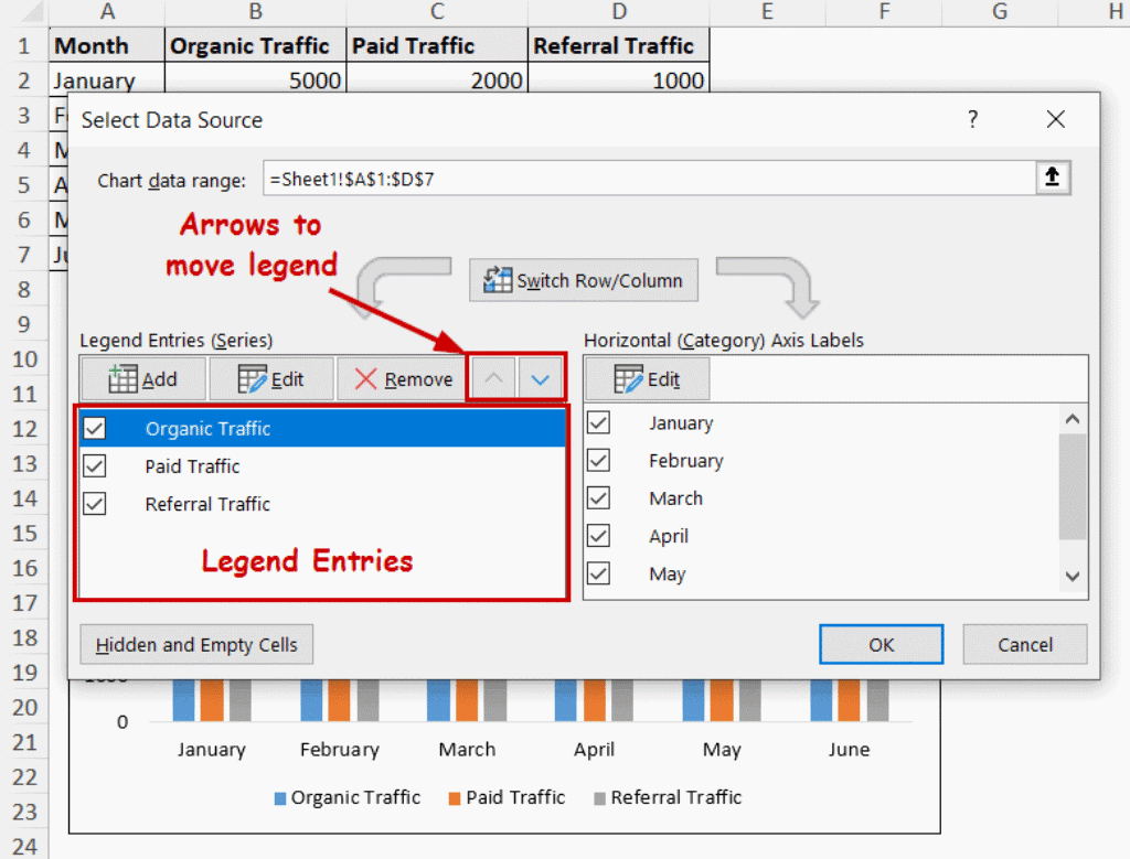
Customizing Legend Labels for Better Clarity
You know that moment when you're staring at a chart and you have no idea what the colors mean? I've been there. We've all been there. It's frustrating, right? You look at a legend and it says 'Category 1,' 'Series A,' or some other meaningless placeholder. Honestly, that's not just a design flaw—it's a communication failure. After a decade of building visualizations for Fortune 500 clients and startups alike, I can tell you this: customizing legend labels is one of the quickest, cheapest ways to make your data actually speak to people. It's a big deal.
The problem is, most people treat legend labels as an afterthought. They import data, let the software auto-generate labels, and hit publish. That's a mistake. A sloppy legend can turn a brilliant insight into a confusing mess. Look—I've seen dashboards with seven shades of blue and labels like 'Value_2023_Q4_Final_v3.' That's not data storytelling. That's a cry for help.
So let's get into it. I'm going to walk you through the exact strategies I use for label customization in every project. We'll cover naming conventions, truncation tricks, color alignment, and even some advanced usability hacks. No fluff. Just what works.
The Silent Saboteur of Your Data Story
First, we need to talk about why this matters so much. A legend is supposed to be a decoder ring for your visualization. But when those labels are vague, inconsistent, or just plain ugly, your reader stops paying attention. Seriously. They have to stop their analysis, squint at the legend, and mentally translate 'Var5' into whatever it actually represents. That's cognitive friction. And friction is the enemy of clarity.
I remember working with a healthcare startup. Their dashboard had a stacked bar chart showing patient outcomes. The legend was a disaster: 'Group 1,' 'Group 2,' 'Group 3.' Nobody knew which group was which. When I asked the product manager what the groups meant, she paused and said, 'Honestly? I think Group 2 is the control?' She wasn't sure. And if the person who built the tool isn't sure, your audience is completely lost.
Why Legends Fail (and You Don't Notice)
Legends fail for three main reasons. First, people use default names from their data source. 'Total_sales_sum' is not a legend label. It's a database field name. Second, people cram too many categories into a single chart. Thirteen items in a legend? That's a list, not a visualization. Third, people ignore the relationship between the label and the visual encoding. If your color is pale yellow and the label says 'Critical Alert,' you've created a cognitive dissonance that confuses the viewer.
Customizing legend labels isn't just about making things look pretty. It's about building trust. When your labels are clear, your audience doesn't have to work to understand you. They can simply absorb the insight. It's a big deal.
The Real Cost of a Bad Legend
Let's talk dollars and cents. In a business context, a mislabeled legend can lead to bad decisions. I've seen a marketing team launch a campaign based on a chart where 'red' meant high conversion and 'green' meant low conversion—but the legend was swapped. They lost a quarter's budget on that mistake. And it could have been fixed with two minutes of label customization.
So don't underestimate this. Your legend is a user interface. Treat it like one. Give it the same care you'd give to a website navigation menu or a mobile app button.
Your Toolkit for Legend Label Mastery
Alright, let's get practical. I've developed a set of rules over the years that I apply to every visualization. These aren't hard-and-fast laws, but they're close. Follow these, and your legends will go from confusing to clarifying.
- Use plain English, not data field names. If your source column says 'RegionCode_Alpha,' change the label to 'North America.' Always. - Be specific but concise. 'Revenue (USD)' is better than just 'Revenue.' 'Q1 2024' is better than 'Quarter 1.' - Match the label to the visual. If you're using a red-green color scale, make sure the labels mention 'High Risk' and 'Low Risk,' not just '0' and '1.' - Keep it short. Three to five words max. If you need more, use a tooltip or a footnote.
Direct Labeling: The Nuclear Option
Here's a controversial opinion: sometimes, the best legend is no legend at all. Direct labeling means placing the label right next to its corresponding data point on the chart. So instead of a separate box of colors, you write 'North America' right over the blue bar. This eliminates the need for the viewer to look back and forth between the data and the legend. It's faster. It's cleaner.
I use this approach for bar charts, line charts with only a few lines, and pie charts (yes, I still use pie charts occasionally, judge me later). However, direct labeling doesn't work for dense scatter plots or complex maps. In those cases, you need a traditional legend. But when it works, it's magic. Customizing legend labels in this context means you're literally moving the label onto the visualization itself.
The Art of the Format Mask
This one is a game-changer. Most tools (Tableau, Power BI, Excel, Python's Matplotlib) let you apply format masks to labels. A format mask controls how numbers and dates appear. So instead of a label that says '1234567.89,' you can make it say '$1.2M.' Or instead of '2024-01-15,' you can show 'Jan 15.'
Legend label formatting is often overlooked. But it's a huge clarity booster. If your chart shows sales data, and the legend says 'Sales: 10345678,' your audience has to mentally format that number. They're doing math in their head while trying to read your chart. That's dumb. Do the formatting for them.
I always apply a consistent format across all labels in the same visualization. If one label says '$2.3M,' the others should say '$1.1M' and '$4.8M,' not '$2300000' or '2.3 million dollars.' Consistency is key.
Truncation with a Safety Net
Sometimes you have long category names. This happens a lot in surveys or product inventories. 'Customer Satisfaction Score - Post Implementation - Q3' is not going to fit nicely in a legend box. So what do you do?
You truncate. But you do it smartly. Use an ellipsis ('...') to show that text has been cut off. And crucially, provide the full text via a hover tooltip or an adjacent footnote. I call this 'truncation with a safety net.'
- Bad: 'Customer Satisfaction…' (no context, misleading) - Good: 'Customer Satisfaction...' (with a tooltip showing the full name) - Better: 'Post-Impl. Satisfaction' (a clear, shortened alias that still makes sense)
When customizing legend labels for long categories, I always create aliases. Spend five minutes renaming those fields. It pays off.
Color and Contrast: The Legend's Silent Partner
Your labels and your colors need to be on the same team. I can't tell you how many times I've seen a legend with perfectly clear labels but colors that are nearly indistinguishable. 'Mild' and 'Moderate' are both light gray? That's useless. The visual encoding and the textual labels must reinforce each other.
Color Palettes That Don't Lie
When you're customizing legend labels, you also need to customize the color assignments. Don't let the tool auto-assign colors. Take control. Use a sequential palette for ordered data (low to high) and a diverging palette for data that has a meaningful midpoint. This makes your labels feel intuitive. When the label says 'High Risk' and it's bright red, the viewer already knows what to expect.
I also avoid using similar shades for adjacent categories. If 'Category A' is #4A90E2 and 'Category B' is #4A8FE2 (almost identical blue), you've just defeated the purpose of the legend. Use the full spectrum. Be bold.
Visual Encoding Beyond Hue
Think about using shapes or patterns in addition to color. This is especially helpful for accessibility. If someone is colorblind, they might not be able to tell the legend items apart by hue alone. So add a circle vs. a square vs. a triangle. Or use hatching patterns in a bar chart. Then your legend label customization can include both 'Red Circle' and 'Blue Square.'
I always design for accessibility first. It's not optional. About 8% of men have some form of color vision deficiency. That's a huge chunk of your audience. Don't exclude them.
Advanced Usability Hacks
Once you've got the basics down, it's time to level up. These are the techniques I use for interactive dashboards and complex reports.
Interactive Legends for Exploratory Data
In a dashboard, you can make your legend clickable. This is a hidden superpower. Clicking a legend item can highlight that series, hide it, or filter other charts on the same page. When you do this, customizing legend labels becomes even more important because the labels are now interactive buttons.
1. Make labels larger. They need to be tappable, not just readable. 2. Add hover states. When someone hovers over a label, change its color or add an underline. 3. Provide feedback. When a user clicks to filter, the label should visually change (e.g., become grayed out) to show it's inactive.
This turns your legend from a static reference into a powerful control panel. It's one of my favorite tricks.
Accessibility First (It's Not Optional)
I mentioned this before, but it deserves its own section. When customizing legend labels, think about screen readers. A screen reader will read the text of your legend, but if your labels are 'Group 1' and 'Group 2,' that's useless. Use descriptive labels.
Also, ensure sufficient contrast between the label text and the background. I use a contrast ratio checker regularly. Small text (under 18px) needs a ratio of at least 4.5:1. Large text can get away with 3:1. Don't guess. Check.
And please, for the love of all that is holy, do not rely solely on color to convey meaning. Use direct labels, shapes, or patterns as a backup. When I say 'accessibility,' I mean designing for everyone, not just the majority.
Common Questions About Customizing Legend Labels for Better Clarity
What is the best practice for truncating long legend labels?
Always truncate at a natural word boundary, never in the middle of a word. Use an ellipsis to indicate truncation. And provide the full text through a hover tooltip or a footnote. If you have control over the data source, pre-create a 'short name' column and use that for the legend. It's cleaner.
Should I use color or shape to differentiate categories?
Use both. Color is great for quick visual scanning, but shape ensures the chart works for colorblind users and in grayscale prints. When customizing legend labels, include both attributes in the label description (e.g., 'Blue Circle' vs. 'Red Square'). It's overkill for simple charts, but for anything with more than three categories, it's a lifesaver.
How do I handle legend labels in a dashboard with limited space?
Prioritize the most important categories. If you have ten series, can you combine some into an 'Other' category? Can you use interactive filtering so the user can choose which categories to display? I often use a scrollable legend or a collapsible panel. And I keep labels as short as humanly possible without losing meaning.
Is it bad to use the exact same label as the raw data column?
Yes. Almost always. Raw column names are designed for databases, not for human eyes. They contain underscores, abbreviations, and technical jargon. Customizing legend labels means translating those names into plain language. 'rev_ann_23' becomes 'Annual Revenue 2023.' Do the translation. It takes 30 seconds.
Can I remove the legend entirely?
Only if you are using direct labeling on every single data point, and the chart is simple enough that the viewer can immediately identify each element. For complex visualizations, a legend is necessary. But you can minimize its cognitive load by placing it close to the data (e.g., at the end of a line series) rather than in a separate box at the edge of the chart.